English
 Русский
  Română
  Deutsch
  Français
  Türkçe
  Español
  Português
  Українська
  български
  Polski
  Indonesia
  中文 (中国)


What Is Whitespace and Why Empty Space Matters on a Website?
Keywords: Quick Reference Before We Start
Before you get into the main article, here are the terms most likely to feel unclear on a first read. You do not need to memorize them — this section is here to make the rest of the article easier to follow.
| Keyword | Brief explanation |
|---|---|
| ↔️ Whitespace | The empty area between and around elements on a webpage that helps the layout feel clearer and easier to use. |
| ⚫ Negative space | Another design term for whitespace. |
| 🔎 Micro whitespace | Small spacing details inside content, like line height, paragraph gaps, button padding, and space around form fields. |
| 🧱 Macro whitespace | Larger spacing between big layout parts, such as sections, cards, sidebars, or navigation areas. |
| 🎯 Hierarchy | The visual order that shows readers what matters first, second, and third on a page. |
| 📏 Line height | The vertical space between lines of text. |
| 📐 Line length | How many characters fit across one line of body text before it wraps to the next line. |
| 📱 Viewport | The visible area of a webpage on a screen, especially important on mobile where content can feel cramped more quickly. |
| ♿ Accessibility | Designing the page so more people can read, understand, and use it comfortably, including people with cognitive or reading difficulties. |
Why Crowded Pages Feel Harder to Use Than They Should
Imagine opening a blog post or landing page where every element seems to compete at once. The headline is pressed close to the text above it. The paragraphs form one dense wall. Images, buttons, and links all sit in the same visual neighborhood with almost no room between them. You can still read the words, but the page asks for more effort than it should.
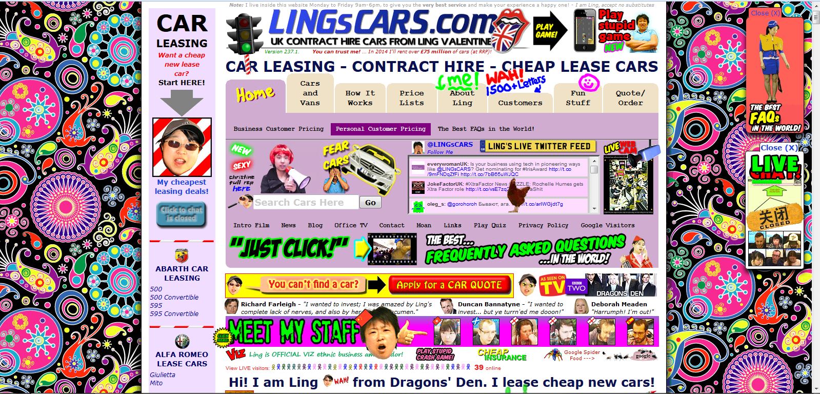
That extra effort is not only about comfort. It affects usability. When a layout feels cramped, readers take longer to understand where to look first, what belongs together, and what action matters most. That reaction often gets blamed on “too much content,” but the real problem is often the lack of space around the content.
This is the hidden job of whitespace. It is not decoration for designers, and it is not unused emptiness. It helps content breathe, guides attention, and makes a page easier to use before readers consciously notice why. Once you can spot it, you can understand what it is, where it appears, why it matters, and how to improve it on your own site.
What Whitespace Actually Means in Web Design
If you are asking what whitespace in web design actually means, the simple answer is this: it is the empty area between and around elements on a webpage. That includes room around text, images, buttons, menus, forms, cards, and entire sections. Designers also call it negative space, but for most website owners, whitespace is the more practical term.
Whitespace does not have to look dramatic. It can be the small gap between lines in a paragraph, the space inside a button, the margin between a heading and the text below it, or the larger separation between one content block and the next. In other words, whitespace is not only the big blank area in a minimalist layout.
📝 Note: Whitespace does not have to be white. A dark page still uses whitespace if its elements have room around them. And in this article, whitespace means layout spacing on a website — not spaces, tabs, or indentation in code.
It is better to think of whitespace as room created on purpose. The goal is not emptiness. The goal is to make each element easier to see and easier to understand.
That is why whitespace acts like structure, not decoration. It tells readers where one idea ends, where another begins, and which elements deserve attention first. Without it, content tends to collapse into a single visual mass, even when the writing, images, and calls to action are individually fine.
Where Whitespace Shows Up on a Website
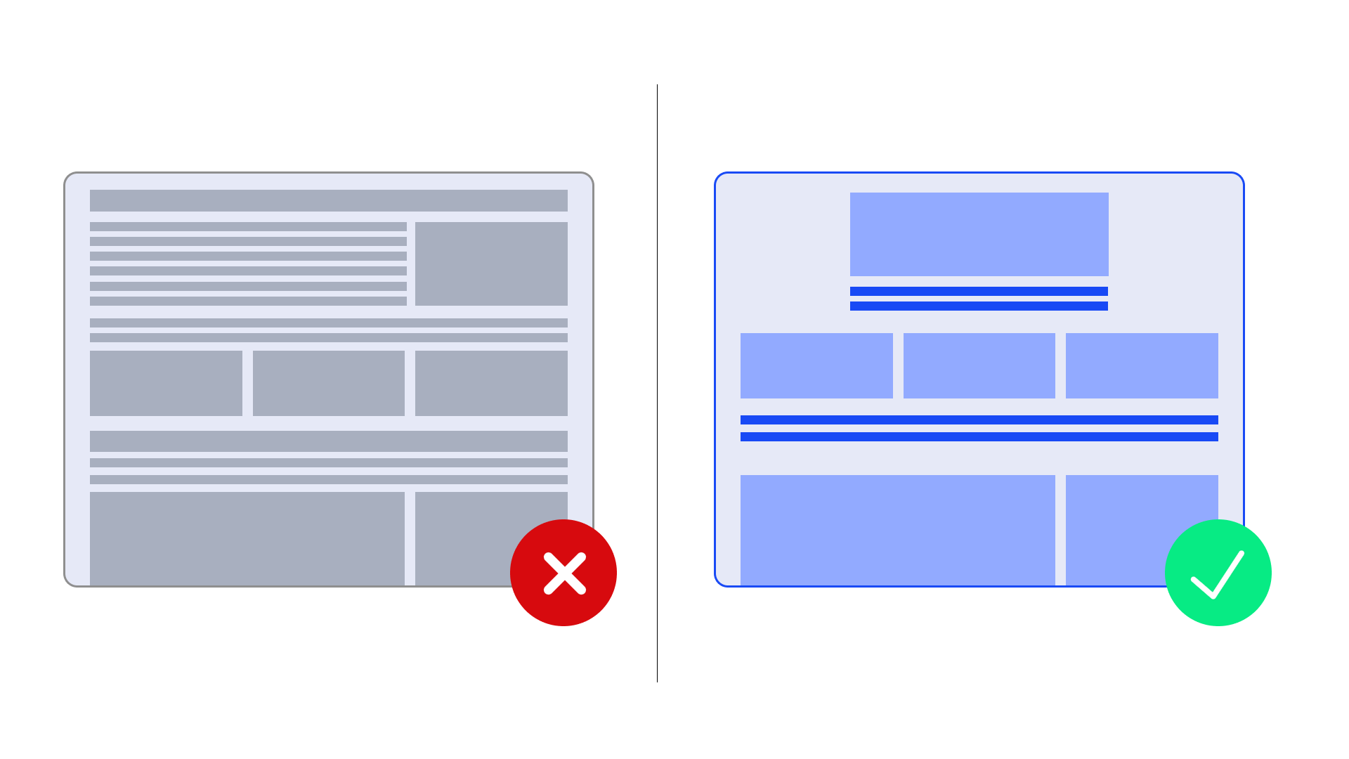
Once you stop thinking of whitespace as “big empty space,” you start seeing it almost everywhere. It appears near the page edges so text does not press against the browser window, around headings so they stand out, and between navigation items, images, cards, and buttons so clickable elements do not feel jammed together.
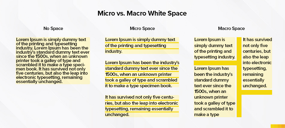
At the smaller level, this is called micro whitespace. It includes line height, paragraph spacing, the space inside buttons and form fields, and the gap between an image and its caption. Micro whitespace shapes the reading experience from line to line and element to element. If it is too tight, the page starts feeling crowded even when the larger layout is technically organized.
The larger level is macro whitespace: the room between major sections, content blocks, sidebars, cards, form groups, or navigation zones. A helpful way to think about it is furniture in a room. Related pieces sit close enough to feel connected, but separate zones need space between them so the room is easy to move through and easy to understand. A webpage works the same way.
The quick distinction below makes the idea easier to remember:
| Type | What it means | Common website examples |
|---|---|---|
| Micro whitespace | Small spacing inside content areas | Line height, paragraph gaps, button padding, form-field spacing, image-to-caption space |
| Macro whitespace | Larger spacing between bigger layout parts | Space between sections, cards, sidebars, navigation areas, banners, and calls to action |
The point is not to memorize design jargon. It is to notice that good website whitespace works at both levels at once. A page can have plenty of room between sections and still feel cramped if the text inside those sections is tight. It can also have readable paragraphs but still feel confusing if the larger blocks are stacked without enough separation.
Why Whitespace Improves Readability, Focus, and Usability
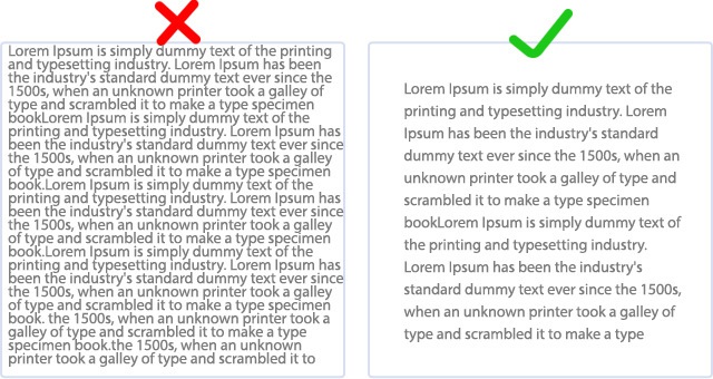
The first job of whitespace is readability. Long-form content is easier to enter when the text has room around it, the lines are not pressed together, and paragraphs are separated clearly. Readers should not feel like they are stepping into a wall of text. A little breathing room lowers the effort required to start and continue reading.
Whitespace also improves scanning. On the web, most people do not read top to bottom on the first pass. They scan first — meaning they quickly look for headings, sections, buttons, and the next obvious step. When spacing is clearer, the eye can jump from signal to signal without getting lost in the noise.
It also makes relationships clearer. A word that often appears in design discussions is hierarchy, which simply means showing the reader what matters first, second, and third. Whitespace helps that hierarchy become visible. Elements that belong together should sit closer together. Elements that do not belong together need more distance.
Another benefit is focus. If one section contains the main action you want the user to take — maybe a signup button, a contact form, or a product detail — spacing can make that element stand out without resorting to louder colors, bigger typography, or visual clutter. Good spacing gives important elements room to be noticed. It helps the eye settle instead of bounce.
Finally, whitespace supports accessibility in practical ways. Dense layouts can overwhelm readers, especially people with cognitive or reading difficulties, but the benefit is wider than that: almost everyone reads more comfortably when a page feels less crowded. Good spacing also means the layout should continue working when users increase text spacing for comfort.
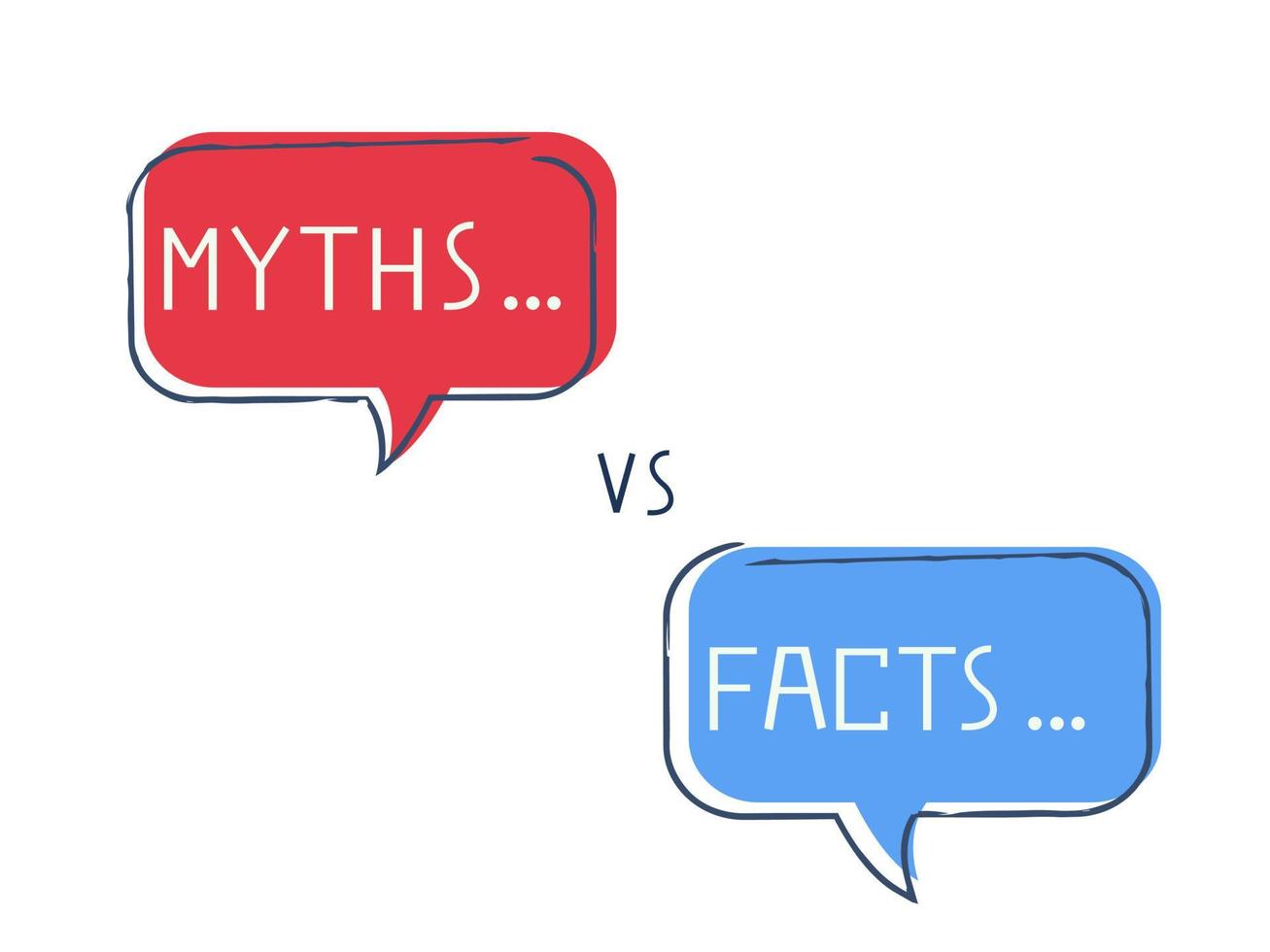
Common Whitespace Myths That Mislead Beginners
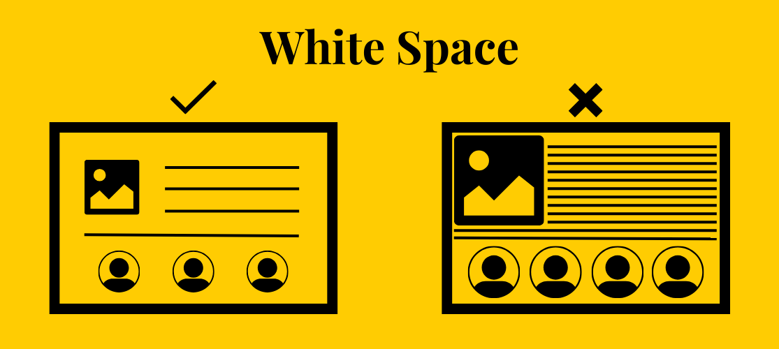
The second myth is the opposite extreme: more whitespace is always better. It is not. If a heading floats too far from the text it introduces, the connection weakens. If a form label sits too far from its field, the reader has to work harder. If a call to action is pushed so far away that it feels detached from the argument leading into it, the layout loses momentum. Good spacing is purposeful, not maximal.
⚠️ Warning: More whitespace is not automatically better. If extra space breaks grouping, separates labels from fields, or disconnects headings from the content below them, it hurts clarity instead of helping it.
Another common myth is that bigger text solves the problem by itself. Larger type can help, but readability depends on more than font size. Line length, line height, margins, and paragraph separation all matter. A page with bigger letters can still feel cramped if everything around them stays compressed.
The last myth is that whitespace can rescue bad structure on its own. It cannot. If the page mixes unrelated ideas, weak headings, unclear priorities, or too many competing actions, spacing will not magically turn confusion into clarity. What whitespace does do is reveal and support good organization. That is one reason overcrowded pages often feel less trustworthy: readers cannot find a clean path through them.
Simple Ways to Use Whitespace Better on Your Site
The good news is that better whitespace usually starts with small adjustments, not a full redesign. Begin with the obvious pressure points: paragraphs, sections, and crowded content blocks. Add clearer breaks so each chunk feels readable on its own.
Next, look at headings and proximity. A heading should sit visually closer to the text it introduces than to the section above it. The same rule works elsewhere too: keep related elements close, and push unrelated elements farther apart. That one habit improves forms, feature lists, card layouts, landing pages, and blog posts.
💡 Tip: Quick spacing checklist: give paragraphs and sections clearer breaks, keep headings attached to the content below them, and add breathing room around buttons, forms, and cards. Then check the same page on mobile to make sure text is not pressing against the screen edge.
For longer reading text, use a few practical rules of thumb. Body copy is often comfortable when line length stays roughly in the 45–90 character range, with the middle of that range usually feeling best. For line height, around 1.5 is a strong starting point for screen reading. These are not hard laws, but they are reliable benchmarks when a page feels cramped and you need somewhere sensible to begin.
Buttons, forms, cards, and calls to action deserve room around them too. When important interactive elements sit shoulder to shoulder with surrounding text or images, they lose definition. The same is true on mobile, where content can start pressing against the viewport edge very quickly.
One final check is accessibility-minded but useful for everyone: loosen the text spacing and make sure the layout still works. If text overlaps, clips, or disappears, the design needs more flexibility. These are low-effort wins for blogs, landing pages, business websites, and hosted sites managed on platforms like AlexHost.
Final Takeaway: Whitespace Helps Content Do Its Job

The “empty” space on a webpage is often the thing making the page usable. It helps readers enter the text, recognize structure, find the important action, and move through the layout with less effort. That is the best way to think about whitespace in web design: not as decoration, and not as wasted room, but as breathing space that helps content do its job — whether you are managing a custom build or working within a hosting environment like AlexHost.
If you want the simplest next step, open one real page on your site today and look for three things: crowded paragraphs, cramped buttons, and sections that blur together. You do not need advanced design training to improve any of them. Small spacing changes can make a page feel clearer, calmer, and much easier to use.