 English
 Русский
  Română
  Deutsch
  Français
  Türkçe
  Español
  Português
  Українська
  български
  Polski
  Indonesia
  中文 (中国)


What Is Whitespac and Why Empty Space Matters on a Website?
Keywords: Quick Reference Before We Start
Before you get into the main article, here are the terms most likely to feel unclear on a first read. You do not need to memorize them — this section is here to make the rest of the article easier to follow.
| Keyword | Brief explanation |
|---|---|
| ↔️ Whitespace | The empty area between and around elements on a webpage that helps the layout feel clearer and easier to use. |
| ⚫ Negative space | Another design term for whitespace. |
| 🔎 Micro whitespace | Small spacing details inside content, like line height, paragraph gaps, button padding, and space around form fields. |
| 🧱 Macro whitespace | Larger spacing between big layout parts, such as sections, cards, sidebars, or navigation areas. |
| 🎯 Hierarchy | The visual order that shows readers what matters first, second, and third on a page. |
| 📏 Line height | The vertical space between lines of text. |
| 📐 Line length | How many characters fit across one line of body text before it wraps to the next line. |
| 📣 Call to action | The button, link, or prompt that asks the visitor to do something, such as sign up, contact you, or buy. |
| 📱 Viewport | The visible area of a webpage on a screen, especially important on mobile where content can feel cramped more quickly. |
| ♿ Accessibility | Designing the page so more people can read, understand, and use it comfortably, including people with cognitive or reading difficulties. |
Why Crowded Pages Feel Harder to Use Than They Should
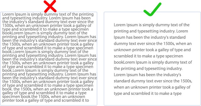
Imagine opening a blog post or landing page where every element seems to compete at once. The headline is pressed close to the text above it. The paragraphs form one dense wall. Images, buttons, and links all sit in the same visual neighborhood with almost no room between them. You can still read the words, but the page asks for more effort than it should.
That extra effort is not only about comfort. It affects usability. When a layout feels cramped, readers take longer to understand where to look first, what belongs together, and what action matters most. That reaction often gets blamed on “too much content,” but the real problem is often the lack of space around the content.
This is the hidden job of whitespace. It is not decoration for designers, and it is not unused emptiness. It helps content breathe, guides attention, and makes a page easier to use before readers consciously notice why. Once you can spot it, you can understand what it is, where it appears, why it matters, and how to improve it on your own site.
What Whitespace Actually Means in Web Design
If you are asking what whitespace in web design actually means, the simple answer is this: it is the empty area between and around elements on a webpage. That includes room around text, images, buttons, menus, forms, cards, and entire sections. Designers also call it negative space, but for most website owners, whitespace is the more practical term.
Whitespace does not have to look dramatic. It can be the small gap between lines in a paragraph, the space inside a button, the margin between a heading and the text below it, or the larger separation between one content block and the next. In other words, whitespace is not only the big blank area in a minimalist layout.
📝 Note: Whitespace does not have to be white. A dark page still uses whitespace if its elements have room around them. And in this article, whitespace means layout spacing on a website — not spaces, tabs, or indentation in code.
It is better to think of whitespace as room created on purpose. The goal is not emptiness. The goal is to make each element easier to see and easier to understand.
That is why whitespace acts like structure, not decoration. It tells readers where one idea ends, where another begins, and which elements deserve attention first. Without it, content tends to collapse into a single visual mass, even when the writing, images, and calls to action are individually fine.